Soho Works brand refresh
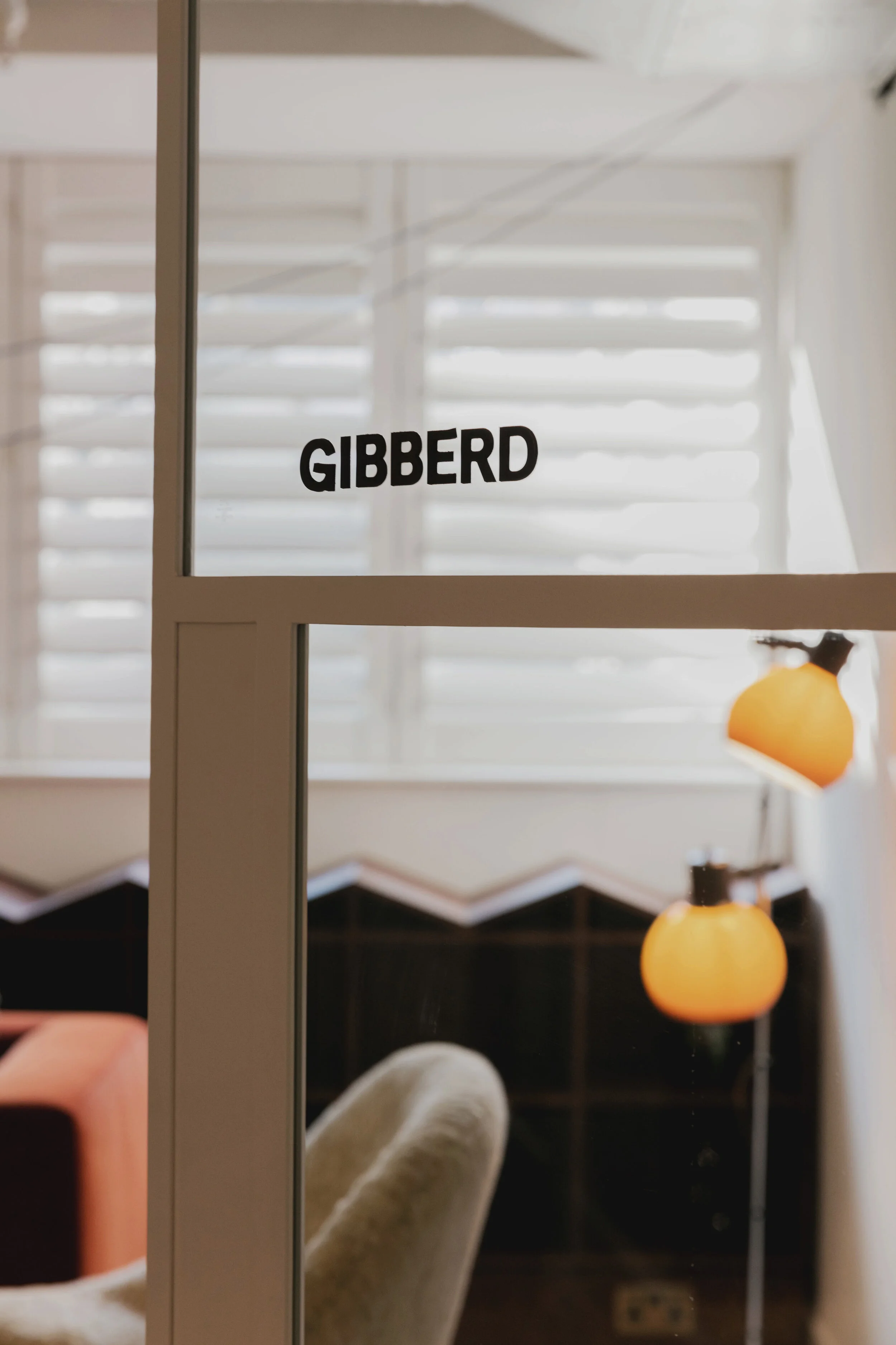
Modernising, refining and aligning a Soho House off-shoot to fit within the suite of brands. Creating a logo that linked to the master brand, but had a distinct point of difference. We introduce a set of four colours to add a playfulness to the co-working spaces identity, with bespoke illustrations commissioned as part of the brand language. Using a combination of the Soho House brand font and an additional chunky sans serif, we created a unique but unified sub brand, creating clear and clean way finding using the typeface.
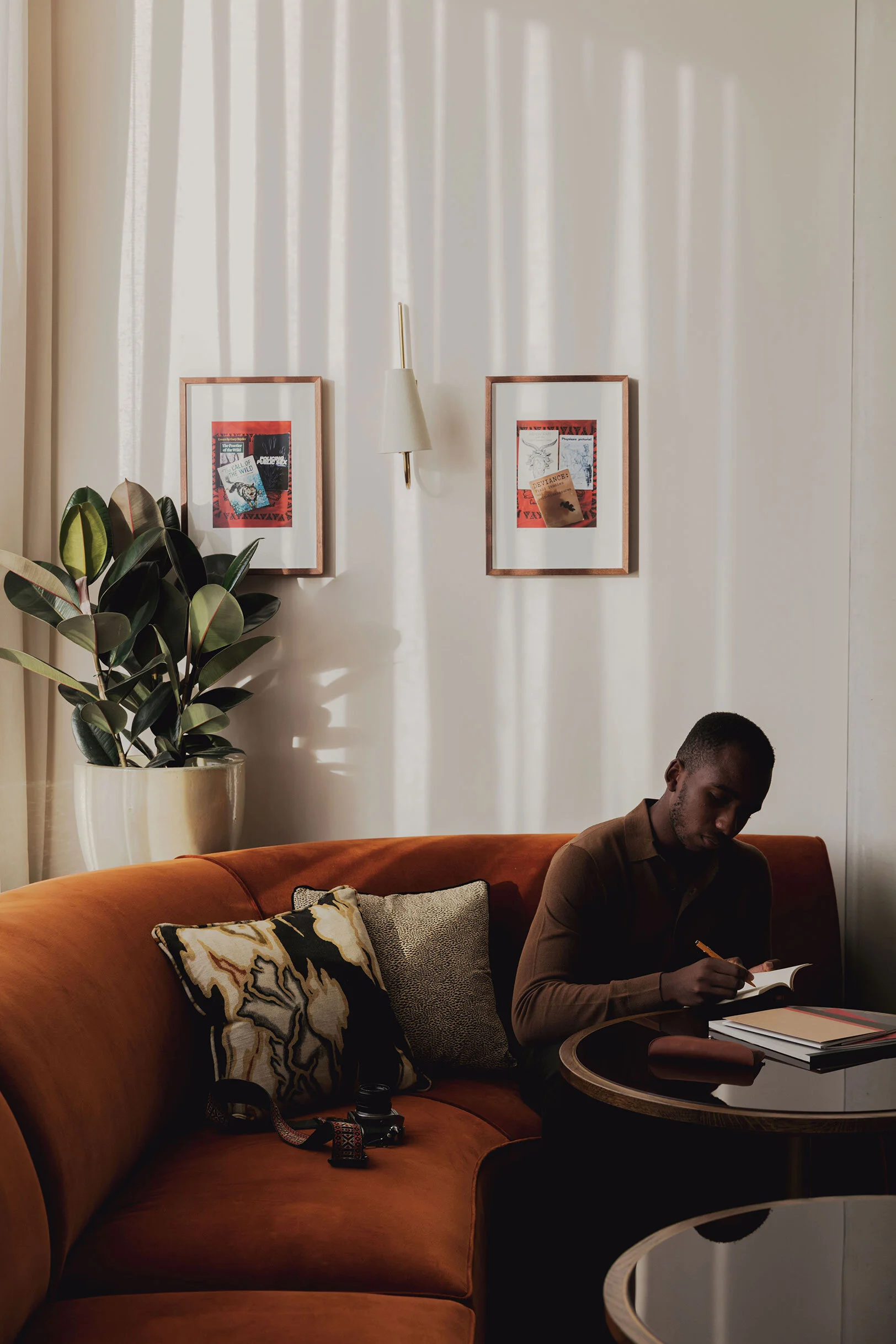
We introduced a tyle of art direction for new sites, that felt intrinsically ‘Soho House’, but had its own feel. Combining a relaxed and effortlessly stylish approach to interior shoots, highlighting the furniture, textures and aesthetics of the workspace, whilst also highlighting what made it special - the members.
In house team - Soho House
Creative Direction - Ruth Costello & Belinda White
Branding Lead - Daisy Hardman
Designer - Alex Scott
Photography - Mariell Lind Hansen


